


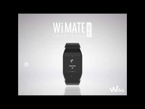


Wiko released a connected bracelet collection called Wimate. These products are aimed at people who are interested in analyzing and tracking their everyday life (sleep, steps, heartbeat, etc.). The main design challenge was to provide a UI easy to read an use on this small form factor by avoiding information overload. You can feel this product direction and decision on the software level as well as on the hardware level as we aim for simplicity and clarity. Another goal for me was to find new graphical cues to allow our product and application to stand out from the competition.
Client : Wiko Role : Art direction, UI/UX, Motion
The Wimate prime offers a colorful and interactive screen. Nevertheless, the quantity of contents and the screen size were major issues when I designed the UI. We had to create understandable mechanics (colors, buttons treatment…) to provide the most seamless navigation as possible.
Wimate prime - Hierarchy & navigation
Wimate prime - Flow to launch the chronometer
Wimate Prime - watch face, iconography & motion researches
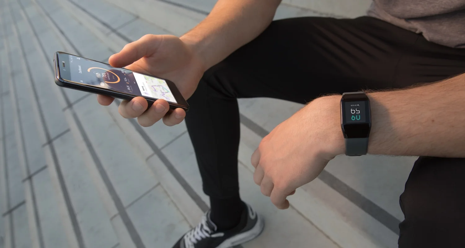
The Wimate lite, Wimate and Wimate came out with a companion app. It provides useful datas helping end users to track theirs exercices and sleep goals.
Companion app - Daily activity tracking
Companion app - Daily sleep tracking
Companion app - Activity card states
Companion app - Heart rate card states
Companion app - Configuration screens sample